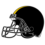
 It’s a question I hear all the time: “Why does the Pittsburgh Steelers helmet only have a logo on one side?” And the answer is usually something like, ‘because it’s distinctive,’ or ‘it’s a long-standing tradition,’ or whatever.
Well you know what? Fuck that. Can I have a logo on my other side now, please?
I mean, come on. This is ridiculous. One side of me looks like a big time, professional sporting team, while the other side looks like what you’d get if you did a stock photo image search for “generic football player.” I’ve sat atop the skulls of six different Super Bowl champion squads, yet the powers that be are still afraid of slapping a logo on my left side like there’s some worldwide shortage of glue or something.
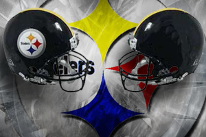 Do you realize that in the statistical category of “number of logos per helmet,” Cincinnati and Baltimore are tied for the AFC North divisional league with two apiece, while I’m stuck down in third place, just one spot ahead of Cleveland? CLEVELAND? It’s embarrassing, people!
The history books tell us that the origin of this “one logo” crap was in 1963, when the Steelers organization first decided to only brand one side of their headgear as an experiment to make sure they liked the look of the logo on the helmet. Hey peabrains: IT’S BEEN 51 YEARS NOW. EXPERIMENT CONCLUDED. I mean, I certainly don’t want to rush you into a decision or anything, but can we safely assume that by this point, we’re all cool with the logo, and begin phase two of its implementation, hmmm?
It’s a lot to ask, I know. After all, I’m dealing with a franchise that once thought this was an attractive look:
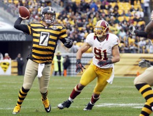
So trust me, I’m not exactly expecting great fashion sense from the geniuses in charge of team appearance. But if I can’t be aesthetically pleasing, can I at least be symmetrical for God’s sake?
We live in a visually driven society where image is everything, and I’m tired of this amateur hour, half-assed look that I’ve been stuck with for too long now. The time has come to logo-fy both of my shiny black sides, so that no matter which angle you choose to observe me from, you’ll be able to clearly see the bright Steelers logo on me, complete with its three colorful diamonds inside a grey circle which signify… which signify… hold up, lemme just wikipedia this.
Holy crap. The logo represents the Republic Iron and Steel Company, a Cleveland-based corporation? You know what? Never mind. How about you just take the logos off me altogether?
